What actually makes a football kit look professional on camera? It’s more than just aesthetics—it’s engineering.
Have you ever noticed how a football kit just pops up on your screen? It’s not just about a cool design. Instead, it’s a deliberate science. The difference between a kit looking sharp on a 4K broadcast versus appearing amateurish is a masterclass in aesthetic planning and technical graphic design.
Modern kits are engineered for the camera, balancing team identity with the harsh reality of stadium floodlights and high-definition sensors. This is where visual communication meets performance technology. Professional designers don’t just ask, “Does it look good?” They ask, “Is it TV-readable?” From the fabric’s finish to the font’s legibility, every element is chosen to look crisp, clear, and professional to a global audience. Consequently, understanding these principles reveals the hidden genius behind your favourite team’s uniform.
Clarity is King: The Science of On-Screen Legibility
The primary job of a kit on camera is instant identification. If viewers and commentators can’t read the names and numbers, the design has failed. Therefore, designers follow strict rules to ensure every detail is perfectly legible.

This is achieved through a focus on high contrast. For instance, league regulations often demand a minimum contrast ratio between the jersey fabric and the lettering. This is why you see bold white numbers on red shirts or sharp black lettering on yellow kits. It’s a simple rule that guarantees clarity.
Analysis of broadcast-ready typography and contrast ratios.
Furthermore, the typography itself is a specialized field.
- Font Choice: Fonts are typically bold and condensed. This style allows for long player names to remain large and readable without looking cramped.
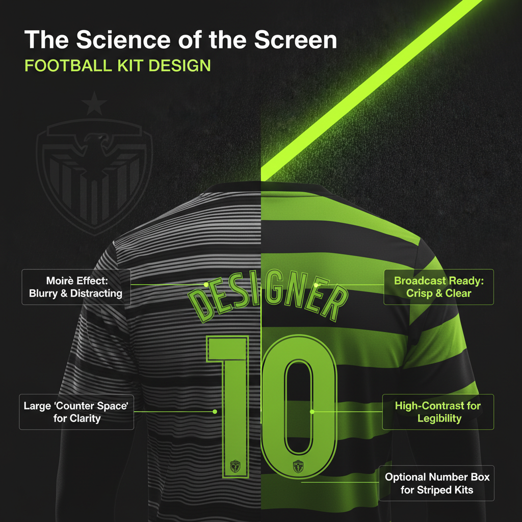
- Counter Space: Modern league fonts are designed with large “counters” (the holes in letters like ‘O’ or ‘A’). This prevents them from blurring into a solid shape when viewed from a distance.
- The Number Box: On striped shirts, a solid box is often placed on the back. This provides a clean, high-contrast background, ensuring numbers don’t get lost in the pattern.
Taming the Light: The Battle Against Glare and Moiré
Stadium lighting is incredibly bright, and modern cameras pick up every reflection. Consequently, managing light is one of the biggest challenges in kit design. A professional look depends on controlling how fabric reacts to intense light.
Avoiding the Shimmer
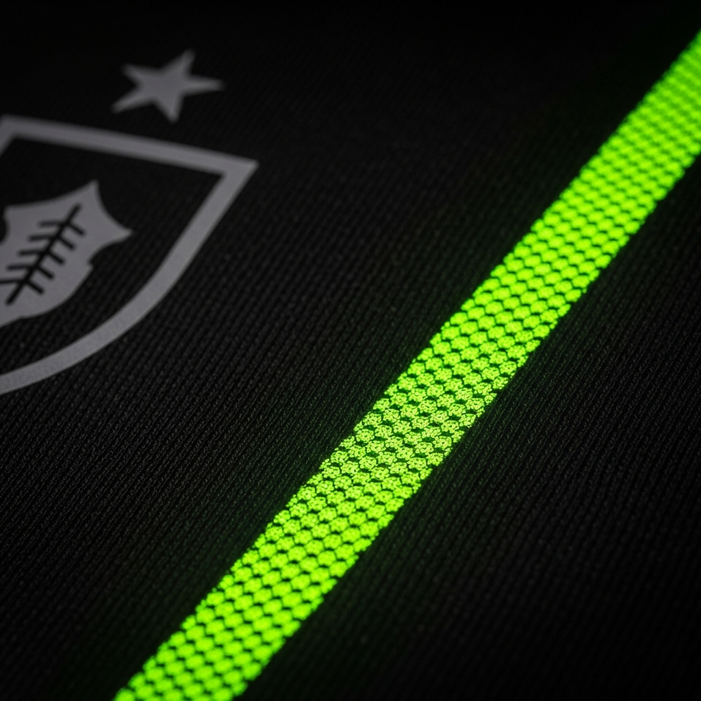
Thin pinstripes often clash with digital sensors, creating a flickering mess known as the Moiré effect. Pro kits use calibrated widths to ensure visual stability.
First, designers almost always choose matte finishes over shiny ones. Matte fabrics diffuse light, which makes colors look solid and rich on screen. Shiny materials, in contrast, create “hot spots” or glare that wash out logos and colors. This is why most professional kits use sublimation, a process that dyes graphics directly into the fibers, avoiding the plastic-like sheen of older iron-on decals.
It Starts with the Fit: The Anatomy of a Pro Kit
Beyond graphics and color, the silhouette of a kit is fundamental to its professional appearance. There is a significant difference between the “Replica” kits sold to fans and the “Authentic” versions worn by players. The professional kit is defined by its athletic, slim fit.
This tailored cut isn’t just for style. A tighter fit prevents the fabric from bunching up or flapping during a sprint, which can look sloppy in slow-motion replays. High-end fabrics are also more structured, so they drape cleanly and hold their shape, even when soaked with sweat.
In addition, advanced fabrics are crucial for maintaining a sharp look throughout the 90 minutes. Materials like Nike’s Dri-FIT ADV, as detailed on Nike News, are designed to wick moisture away instantly. This prevents the heavy, dark sweat patches that can make a kit look unkempt and unprofessional mid-match.
A Player’s Perspective: When Performance Meets Aesthetics
Ultimately, the player has to wear the kit. Their comfort and confidence are paramount, and their feedback directly influences design. This is where the philosophy of “look good, feel good, play good” comes into play. Psychologists call this “enclothed cognition”—the idea that what we wear directly influences our mindset.
Players want kits that feel like a second skin. Any friction or unnecessary weight is a distraction. This is why pros prefer heat-pressed crests over embroidered ones, as they sit flat and prevent chafing. It’s also why many players customize their kits, such as cutting holes in their socks to relieve calf pressure.
Moreover, the visual design impacts on-field performance. Players need to identify teammates with a glance. High-contrast kits that “pop” against the green pitch can actually speed up decision-making during a fast-paced game. Brands like Adidas now hold player workshops to gather this crucial feedback, which you can learn more about on Adidas News.
Conclusion: A Symphony of Design and Technology
In the end, what makes a football kit look professional on camera is a complex symphony of intentional design choices. It is the result of meticulous aesthetic planning where every element serves a purpose. From the broadcast-safe color palette and anti-Moiré patterns to the player-approved athletic fit, a modern kit is a high-performance tool built for the world’s biggest stage. It’s a testament to how graphic design, when blended with technology and psychology, can elevate a simple uniform into a piece of professional art.


