How a ‘Full Time Result’ Graphic Drives Social Media Growth
A simple score update? Think again. The ‘Full Time Result’ graphic is a sports team’s most powerful social media tool. When done right, it’s not just information; it’s a digital victory lap. It transforms a simple post into a viral asset, shared enthusiastically by fans across the globe. Consequently, understanding its anatomy is crucial for driving massive organic reach.
The Visual Core: Crafting the Emotional Tone
The foundation of your graphic is its emotional impact. This starts with the imagery you choose.
The “Hero” Image
First, you need a powerful “hero” image. Forget generic headshots. Instead, use a high-action shot from the match. The winning goal celebration or a player showing raw, triumphant emotion is perfect. This immediately connects with the fans’ feelings. To make your star player pop, use a high-quality cutout. Furthermore, applying a subtle inner glow or edge highlight helps separate them from the background, creating a professional, layered look.
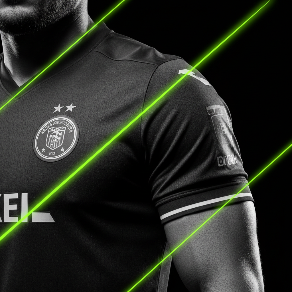

To achieve a cinematic feel, use a “Dodge and Burn” technique. This popular method accentuates shadows and highlights on the player’s muscles and jersey. As a result, the image looks less flat and far more dynamic.
The Scoreboard: A Lesson in Clarity
The score is your headline. Therefore, it must be instantly readable. Place the final score in the center or top-third of the graphic for maximum impact. Use a bold, heavy sans-serif font that grabs attention.
Design Tip
“If you won, use your team’s primary brand color. If you lost, switch to a muted, monochromatic palette to acknowledge the fans’ disappointment.”
Color is also key. If you won, use your team’s primary brand color prominently. This reinforces the celebration. However, if the team lost, top clubs often switch to a muted, monochromatic palette. This simple change respectfully acknowledges the fans’ disappointment. Below the main score, list the goal scorers and their minutes in a smaller font, grouped under each team’s logo.
The Branding Layer: Adding Authenticity and Energy
With the core visuals in place, it’s time to add layers of branding that scream energy and authenticity.
Loud Typography and Logo Lockups
A stylized “FULL TIME” or “FINAL” banner is essential. Current design trends lean into maximalist typography. This means using stretched, outlined, or even warped text that feels loud and energetic. It’s a statement. In addition, place the two team crests near their respective scores. Ensure they are balanced in size for a clean, professional look.
Texture and Grit for a Premium Feel
Modern sports design is embracing a retro, gritty aesthetic. To achieve this, add a subtle overlay. For example, a “Film Grain,” “Paper Texture,” or “Halftone” effect can give your graphic a premium, tangible quality. This small detail moves your design from digital to artistic.
The Growth Engine: Turning a Post into a Strategy
A great graphic doesn’t just look good; it actively works to grow your channels.
Monetization and Engagement
The bottom corner of the graphic is prime real estate. This “Sponsor Pocket” is perfect for placing a partner’s logo, often with text like “Full Time Result presented by [Brand Logo].”
Moreover, you must prompt interaction. Instead of just posting the score, add a small call to action. Simple questions work best:
- 👉“Your Man of the Match? 👇”
- 👉“Describe this win in one emoji.”
- 👉“What was the key moment for you?”
This simple trick encourages comments, which signals to social media algorithms that your post is highly engaging.
The “Shareable” Aspect
Finally, design the platform. While 1:1 square graphics still work, the 4:5 (Instagram/Facebook) and 9:16 (Stories/TikTok/Reels) aspect ratios are more effective at stopping the scroll. They fill more of the screen, demanding more attention.
When Victory Slips Away: The Art of the Losing Graphic
Not every match is a win. Consequently, the design strategy must adapt for a loss. A perfect losing graphic is minimalist and sober. It trades celebration for quiet reflection.
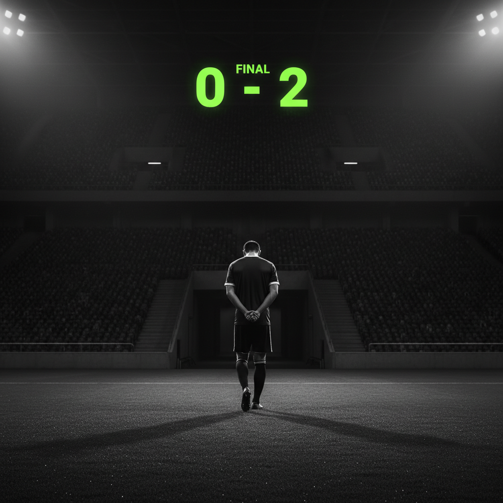
Instead of a hero shot, use a wide-angle image of the empty pitch or a player walking away with their head down. The color palette should be muted and monochromatic. This approach creates a sense of “shared struggle” with the fanbase. It shows the club is with them in disappointment, which builds long-term loyalty far more effectively than a generic score update.
Conclusion
In conclusion, a ‘Full Time Result’ graphic is far more than a score. It is a powerful storytelling tool. By focusing on a dynamic hero image, a clear scoreboard, authentic branding, and strategic growth elements, you can transform a simple update into a viral engine. Remember to tailor the mood for wins and losses to build a stronger community bond. Ultimately, mastering this graphic is a key strategy for any sports team looking to dominate social media.


