How to Design a Modern Football Club Crest
A football club crest is more than just a logo. It’s a symbol of history, a beacon of pride, and the heart of a club’s identity. It tells a story on jerseys, banners, and social media, uniting fans across the globe.
But how do you create a modern crest that feels both timeless and fresh? This guide dives into the essentials. We’ll explore the fusion of strategic branding and sharp graphic design needed to craft a powerful football crest from scratch. Whether you’re in the US, UK, or anywhere in between, these principles will help you create a symbol that resonates.
The Foundation: Understanding the Club’s Brand Identity
Before you even think about colors or shapes, you must understand the club’s soul. A crest is a visual representation of a brand, so the first step is always strategy, not sketching. This foundational work ensures the final design is meaningful and authentic.

Mission, Vision, and Values
First, what does the club stand for? Is its identity built on relentless attack, community roots, or a history of underdog victories? These core values are the emotional anchor for your design. A strong brand promise, consistently delivered, builds trust and loyalty among supporters. This is the story the crest needs to tell instantly.
History and Heritage
A club’s past provides a rich well of inspiration. Look for historical symbols, local landmarks, or significant events tied to the community. These elements create a deep cultural connection that a generic design simply cannot match. For instance, incorporating the year of establishment is a simple yet powerful way to communicate tradition and longevity.
Core Principles of Modern Crest Design
With the brand identity defined, you can move on to the visual design principles. Modern crests must be impactful and functional in a digital-first world. This requires a focus on clarity and versatility.
Simplicity is Strength
Minimalism often creates the most memorable result. A clean, uncluttered design is easier to recognize and recall, whether seen from the stands or on a small phone screen. Therefore, avoid cramming too many ideas into one symbol. Focus on a single, powerful concept.
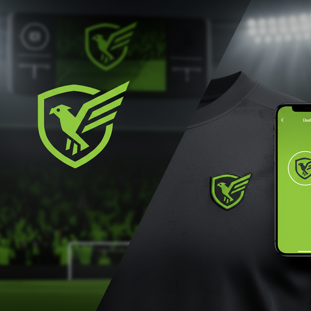
Scalability and Adaptability
Your crest must look sharp everywhere. It needs to maintain its integrity across countless applications: from large stadium banners to digital app icons and social media profiles. A truly effective design works perfectly in full color, but it must also be legible in a single color (black or white). This adaptability is non-negotiable for a modern brand.
Timelessness Over Trends
Design trends come and go, but a club crest should endure for generations. While it must feel contemporary, it should avoid fleeting styles that will quickly look dated. The goal is to create a classic symbol that respects tradition while looking confidently toward the future. For more on creating lasting brand visuals, check out this guide on building a brand identity.
The Key Visual Elements of a Crest
Now we get to the building blocks of the crest itself. Every element—from the overall shape to the choice of font—is a communication tool.
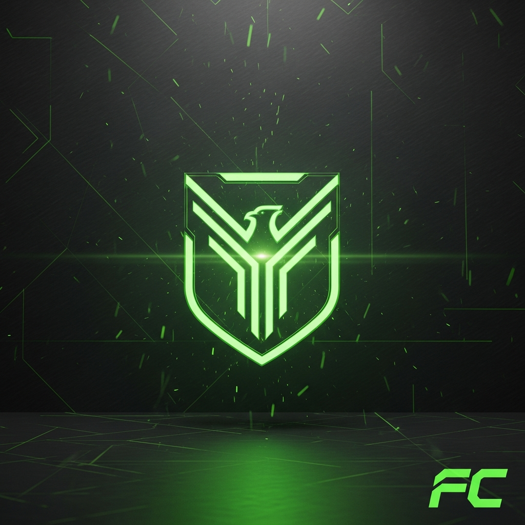
Shape, Symbols, and Hierarchy
Traditional shields and circular badges remain popular for a reason; they convey strength and heritage. However, modern designs can explore more abstract shapes to communicate dynamism. Within that shape, use symbols that represent the club’s story. Visual hierarchy is crucial here; it guides the viewer’s eye through the design logically, ensuring the most important elements stand out first.
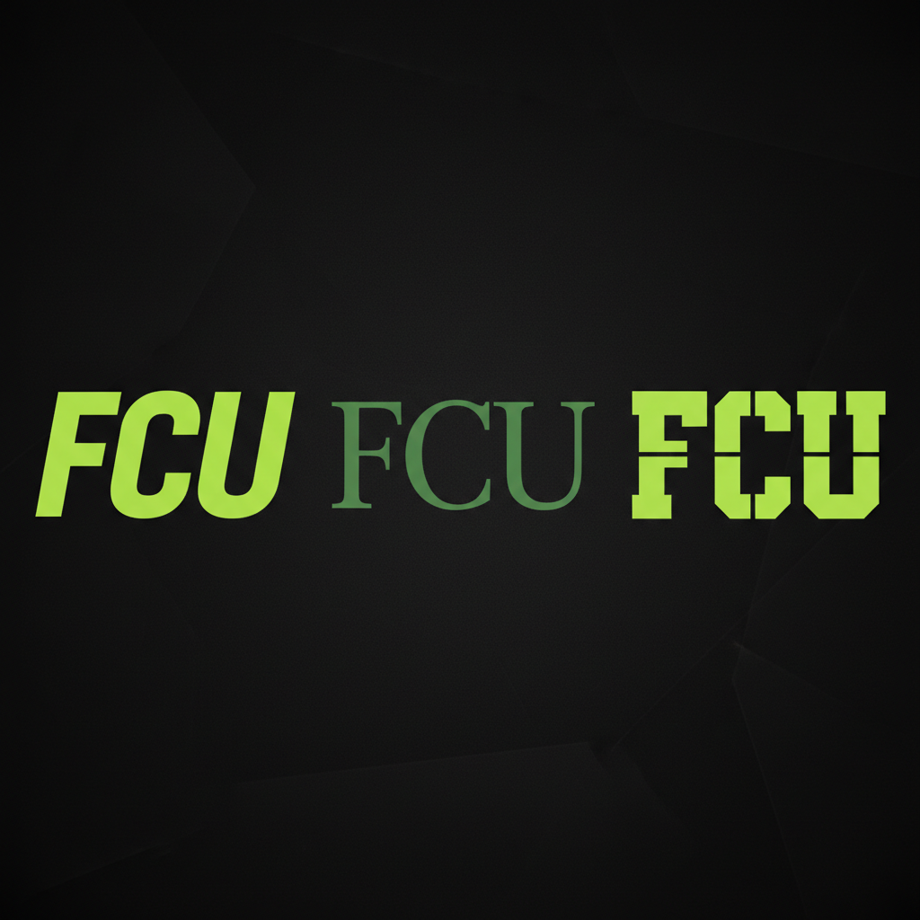
The Power of Color and Typography
Color is a vital part of a crest. It evokes emotion and signals identity instantly. Your chosen color palette should reflect the team’s energy and spirit, with careful consideration given to historical significance. Similarly, typography sets the tone. A bold, rigid font can convey power and determination, while a more classic typeface might nod to the club’s long history. Readability is paramount; the font must be clear at any size.
The Designer’s Toolkit: From Sketch to Software
Bringing a crest to life requires the right tools and a professional process. While ideas may start with a simple pen and paper sketch, digital execution is where a crest becomes a versatile brand asset.
Industry-standard software is essential for creating professional, scalable vector graphics. The Adobe Creative Suite, particularly Illustrator, is the go-to for logo and crest design because it creates vector art that can be resized infinitely without losing quality. You can explore a wealth of tutorials and insights on the official Adobe Creative Cloud blog post on logo design.
Ultimately, creating a modern crest is a professional endeavor. Hiring a designer or studio specializing in brand identity ensures a high-quality, strategic outcome. They understand how to translate a club’s identity into a compelling visual system, as shown in case studies from top agencies like this professional sports branding studio.
Conclusion: More Than a Mark
Designing a football club crest is a journey that blends art, history, and strategy. It begins with a deep understanding of the club’s identity and values. It then moves through the core principles of modern graphic design—simplicity, scalability, and timelessness—to build a powerful visual.
The final result is far more than just a logo. It is a unifying symbol that carries the weight of history and the promise of the future. It’s the emblem that fans wear with pride, a mark that truly represents the heart and soul of the club.


