Professional Playbook 2026
Amateur Heart.Professional Identity.
Your team plays with professional heart. Shouldn’t it look the part? Elevate your organization from the local park to the big leagues with our guide to “Minimalism with Meaning.
Moving beyond generic clipart, the trend for 2026 is “Minimalism with Meaning.” This guide will walk you through building a powerful brand kit, from choosing impactful colors to designing a logo that looks great everywhere.
Your Team’s Essential Toolkit: What’s in a Brand Kit?
Think of a brand kit as your team’s visual toolbox. It ensures everyone—from players to parents—uses the same branding consistently. This consistency is the fastest way to look like a serious, unified organization. A complete kit is more than just one logo; consequently, it contains several key assets.

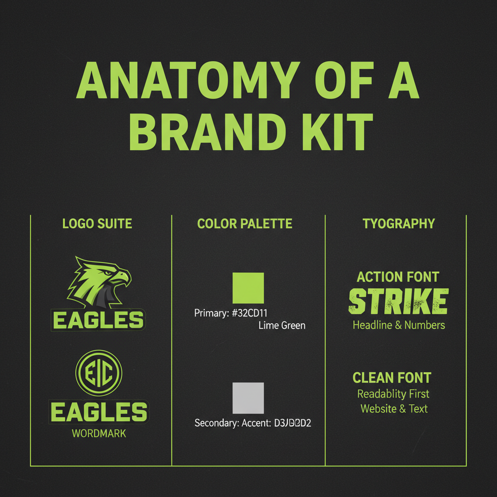
- Logo Suite: This isn’t just one image. You need a primary logo for jerseys, a secondary submark for social media, and a wordmark for team gear.
- Color Palette: Limit yourself to 2-3 main colors. Crucially, use specific Hex Codes to ensure consistency across web and print.
- Typography: Select an “Action” font for headers and a “Clean” font for easy reading in newsletters.
Finding Your Identity: Popular Styles for 2026
To create a lasting identity, avoid chasing overly complex trends. Instead, choose a clear aesthetic that reflects your team’s personality. The “chrome” look of the early 2000s is out; minimalism and storytelling are in.
Heritage Reimagined
Vintage varsity fonts and muted colors like forest green or burgundy. Classic prestige.
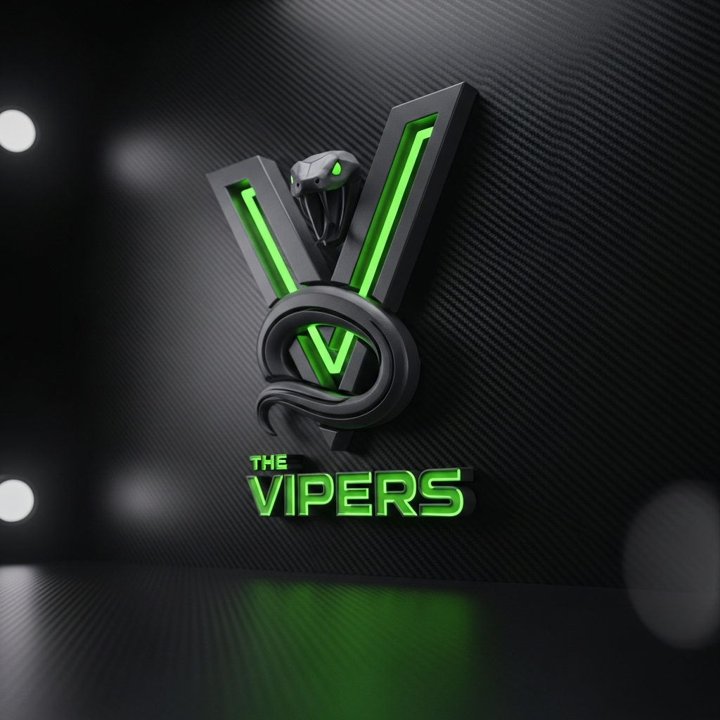
Pixel-Sharp Tech
Sharp angles and neon accents. Perfect for high-energy sports and esports.
Hand-Drawn Authenticity
Brushstroke logos and freehand mascots. Approachable and community-focused.
More Than Just a Color: The Psychology Behind Your Palette
Your team’s colors communicate its identity before a single play is made. Color choice can influence player psychology and opponent perception. Picking the right palette is a strategic decision.
The Rule of Three
A professional palette follows the 60-30-10 rule: 60% Primary Color (jersey base), 30% Secondary Color (contrast panels), and 10% Accent Color (pop for trim).
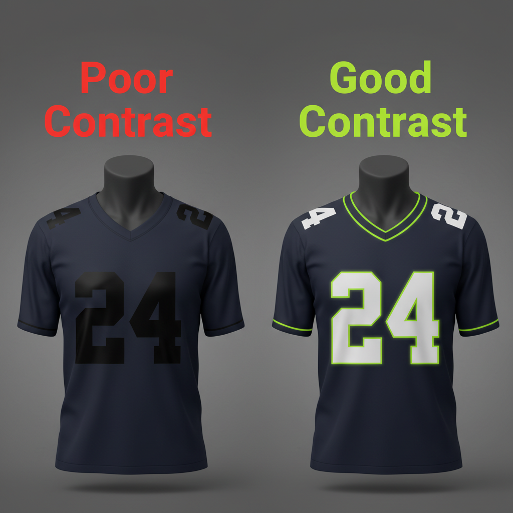
Remember the Contrast Rule. Your jersey numbers must be easy to read from a distance. To explore different combinations, you can use a free tool like the Wooter Apparel Uniform Generator.
Designing a Winning Logo: Key Principles
A great sports logo is simple, memorable, and adaptable. It needs to work on a tiny phone screen and a large banner. Before you start designing, keep these core principles in mind:
1
Simplicity is Key
Test your design with the “1-Inch Test”—if you shrink it down, is it still clear? For high-quality icons, check out Adobe Express.
2
Create Dynamism
Sports are about movement. Use italics or sharp angles to create forward momentum.
3
Ensure Adaptability
Your logo must look good in full color and in one color (black or white) for different printing methods.
Budget-Friendly Branding: Top Free Tools
You don’t need expensive software to create a professional brand kit. Several powerful and free online tools are perfect for amateur teams.
- Canva: The best all-around tool. You can start designing on Canva’s free logo maker.
- Adobe Express: Offers incredibly high-quality templates and fonts that give your brand a premium feel.
- Coolors.co: A fantastic palette generator that ensures colorblind accessibility.
Conclusion: A Brand That Unites
Building a brand kit is one of the most effective steps an amateur team can take to look and feel more professional. It fosters a sense of unity among players and creates a recognizable identity within your community. With powerful free tools at your fingertips, there has never been a better time to give your team the winning look it deserves.


